Countries By Military Budget(Expenditure)
The Map Above Explained
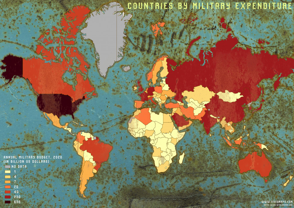
The map above is how much a country spends on its military annually. For example: Russia, China, India, and Saudi Arabia spent between 250-650 billion dollars on their military, while the US of A spent over 650 billion dollars on its military; representing a 1/3rd of the entire world's military expenditure alone. There are also countries such as Costa Rica and Iceland that do not have a military at all, so that's why they show as "NO DATA" in the key. They also show how rich a country is because this is totally based on amount of money. So countries such as the UK, Germany, and France have a higher expenditure than all of Africa combined. So that's the map above explained in this short paragraph.
